
Name, Slogan and Logo Design: "İslamic Source"

 İslamic Source
2026-08-14
İslamic Source
2026-08-14
Assalamu alaikum wa rahmatullahi wa barakatuh.
Bismillah.
In today's article, inshaAllah, we will examine in detail how to choose a name for any business, venture, channel, or brand, how to select a slogan, and how to prepare a logo; we will look at the key points of these topics and demonstrate them through a real case. We will explain where the name and logo of Islamic Source came from, how the design process progressed, and why the chosen shapes, colors, and fonts were selected, inshaAllah. Thus, we will have explained the logo and brand design process to you through a real example.
1- Choosing a Brand Name
Choosing a brand name is a very important matter. People communicate through the meanings they attach to words. Therefore, when naming something, it is important to choose words with the right connotations. For instance, if you are starting an automobile company, the cars you sell are generally classic cars, and the audience you want to target is young people, then you need to give your company a name that suits this; for example, you could choose a name like "New Classic" that appeals to both your product and your audience. However, another important point that emerges when choosing a name is to differentiate yourself especially from other names in the same market. Because choosing a name similar to others in the market will make you blend in with them. Therefore, choosing a name that highlights the points where you differentiate yourself can make you stand out. For example, going back to our automobile example, the phrase "... Garage" is very popular in the automotive sector, so one should avoid this name. However, the name "New Classic" we chose stays away from this cliché and also conveys the message we want.
We thought a lot when choosing the name for "Islamic Source." First of all, since we want to serve in the name of Islam, a name appropriate to this was needed. Because Islam is universal, we had to choose a name that appeals to people of every race, age, and gender. In addition, since our main goal is to provide materials and resources for Muslims and to unite Muslims, we wanted to choose a name that refers to this. Therefore, the concept of "Open Source," which represents that the source codes of digital projects are open to everyone, that everyone can always access them for free, benefit from them as they wish, and contribute if they want, was ideal for us. Since we wanted to appeal to everyone, choosing English, the most popular language of our time, could make our name reach more people. Moreover, since we aim to provide resources for Muslims in many religious and worldly fields, not just software, the phrase "Islamic Source" fit us perfectly. Additionally, since the word "Islam" is the same in every language and the concept of "Open Source" is known by many people, our name transcended being merely English. In addition, when we looked at existing Islamic brands and names, we saw that such and similar phrases were not very common, and Islamic names generally preferred similar names. This also provided us with a nice opportunity to differentiate ourselves.
Here is a small message for those who want to choose an Islamic brand name. If you are going to choose a name for your own Islamic brand, instead of classical names, refer to the features that make you stand out and unique. Especially the new generation likes and adopts different and modern names much more than standard ones. For this reason, it may be beneficial to choose names that make Islam and being Muslim feel prestigious and special, not boring, in the eyes of the youth.
2- Choosing a Brand Slogan
Choosing a slogan is important, though not as much as the brand name. A slogan is short, summarizes the brand and its purpose, is literary, and is generally a single sentence. While the brand name describes the brand with a name, the slogan delivers the main message in a single sentence. A good slogan needs to be memorable and pleasant to the ear. Moreover, just like with the brand name, it should be far from clichés. For instance, going back to our automobile example, "New Classic" aims to sell classic cars to young people, so a slogan like "New generation, old style" could work.
When choosing a slogan for Islamic Source, we wanted to choose a slogan that is far from clichés, describes us, is simple, and is universal, just like with the name. For this reason, we chose the slogan "made by Muslims, for Muslims." First of all, we chose English as the language, but this slogan can be beautifully translated into languages like Turkish and Arabic without disrupting its rhythm and meaning. The phrase "made by ... / made in ..." is very popular today. Appearing on almost every product from digital to physical, this phrase was a very nice choice because we are all familiar with it. As for meaning, in its most plain form, it expresses who we are and what we work for.
3- Logo Design
A logo is perhaps an even stronger representative of a brand than its name. A good logo can represent the brand alone, even without the brand name. Logo design is perhaps even more complex and difficult than naming. Because while choosing a name and slogan, we benefit from certain words. However, in logo design, things work differently. When designing a logo, there are many points such as whether the shapes to be used in the logo will be sharp or round, what images will be used, what colors will be used, how these will be combined, how it will look on different sizes and backgrounds. Because even whether a line is curved or straight can contain different meanings and imageries. Therefore, it is not possible for us to examine logo design under a single heading. So, below we will first look at the fundamental principles of logo design, and then collectively look at how these were used in Islamic Source's logo, inshaAllah.
Simplicity: The human brain does not like complexity. It struggles to process and remember complex and crowded things. Therefore, the logo should consist of as few and clear elements as possible. However, while doing this, important details should not be skipped.
Timelessness: The logo needs to be timeless. If the logo is too tied to the trends of its time, this will cause it to appeal only to a limited audience for a limited time.
Memorability: Today, people are exposed to hundreds, maybe thousands of logos. Therefore, they do not look at the logos they see for more than 3-5 seconds and forget most of them. This is why it is very important for the logo to be memorable. Even after looking at it for 3 seconds, a person should be able to remember the logo, at least in its main outlines.
Distinctiveness: The logo needs to differentiate itself especially from other logos in the same sector and symbolize and represent the brand. Logos that show similarities with other logos make it difficult for the brand to stand out and differentiate. The brand's ability to be distinguished from others at first glance depends on the logo.
Uniqueness and Originality: Unique, extraordinary, personalized, and original designs attract more attention and are more memorable than cliché ones. For this reason, when designing a logo, one should stay away from classical shapes, colors, and imageries. Or classical shapes and images can be used by interpreting them in a different way.
Meaningful Relationship: The logo must have a meaningful relationship with the brand name, business, slogan, and character. It is very important that the logo has direct and indirect meaningful relationships with the brand name, the sector worked in and the job done, the brand's slogan, the brand's corporate language, goals, and character, and even the brand's audience.
Typography: Logo design is not just about the symbol. Because the logo represents the brand and the brand name together with typography. Typography is the art and technique of arranging letters, numbers, and symbols in a readable, orderly, and aesthetic manner. Typography is not just font selection. It is a complex art of character aesthetics that includes the size, position, small details, and placement of the font, and is as important visually as the logo itself.
Scalability: A logo does not only appear on a website or profile picture. The logo can be found on a wide variety of media and backgrounds. In the digital environment, it can appear in many different sizes, from profile pictures to banners, from video end screens to website icons. In the physical environment, it can appear in many different sizes again, from billboards to business cards. Therefore, the logo needs to be open to scaling. For this reason, it is not appropriate for the logo to contain very thin lines and complex strokes. Additionally, the logo must be designed in such a way that it maintains its visibility on different backgrounds.
Geometry, Proportion, and Alignment: The shapes and typography used in logo design are as important as their proportions and alignments. For instance, a logo that is quite properly aligned and proportioned can create a formal institution atmosphere, while a logo placed with different proportions and non-standard alignment can feel more unserious, fun, and rule-breaking.
Negative Space: In logo design, the unused space is just as important as the used space. Because the brain also makes sense of the spaces between shapes, empty space is not merely unused area. When negative space is consciously used to create a second shape, letter, or message, it adds both meaning and memorability to the logo.
Shapes: Since geometric shapes create different associations in people, the choice of form must match the brand's character. For example, a circle can create perceptions like wholeness and unity, a square like trust and order, a triangle like dynamism and direction, a vertical line like strength and determination. However, these meanings can contain different significations depending on where they are used and the other elements they are together with.
Colors: Since colors quickly affect the way people perceive the brand, color selection should not be made randomly. For example, red can make common associations like energy and attention, blue like trust and calmness, green like nature and growth, yellow like optimism, black like power and prestige; however, colors and the meanings they express can change depending on the area they are used in. Therefore, it is important to choose a color palette that matches the shapes, geometry, and proportions of the logo. As another consideration, because too many colors in a logo increase visual complexity and make consistency in printing difficult, usually 3–5 main colors are sufficient. Moreover, while RGB colors are chosen for the screen, the CMYK equivalents of these colors should be determined for printing, and it should be ensured that the colors appear as consistent as possible on different media.
Black/White Logo: It is not possible or appropriate to use the logo with all its colors on every background and medium. Therefore, monochrome versions of the logo should also exist. In fact, a successful logo must be able to work even without color. For this reason, the logo should first be designed in its colorless, only black version. Then, the white version of the logo should be prepared. Finally, the colored version should be prepared. However, designing the white version of the logo is not just the inverted version of its black version. On the contrary, preparing a white version of a logo is a task in itself because reflecting the design correctly is very important. It must be determined which parts will be filled and which will be empty, and which parts being white will show the integrity and meaning of the logo more accurately. Additionally, on a black background, white color will cause glare, so the logo may appear larger than it is. For this reason, generally, when preparing a white version of a logo, the logo's lines are thinned.
Different Compositions: A logo is not always found alone. Sometimes it may appear with the brand name, sometimes with the brand name and brand slogan, sometimes with only the brand's initials, and even sometimes with the brand name, slogan, and establishment date. Therefore, it is very important to prepare different compositions of the logo.
Consistent Language: A brand is, in a sense, a separate personality. It creates a unique character through elements like its logo, name, slogan, products, and brand language. For this reason, to prevent your brand from experiencing a personality disorder, all these elements must be prepared consistently and be in harmony with each other.
Now that we have learned all this, we can move on to the logo design process of Islamic Source and its logo.
Islamic Source Logo
Designing the logo of Islamic Source took us a full 15 days. In this process, we tried many different designs. We made all our sketches on paper, and finally we transferred the logos we decided on to the computer environment and re-evaluated them. Among our first designs, we tried many different attempts, from classical shapes like a mosque to the Kaaba with a sun rising over it, from a quill pen and sword between brackets to much more intriguing designs. Actually, our brand name was clear, our goal was clear, and therefore, what we expected from the logo and what we wanted it to represent were also clear. For this reason, it was not very difficult to set a direction. However, reaching an original design was not easy.
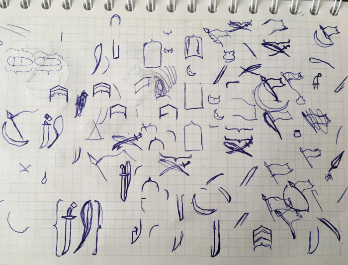
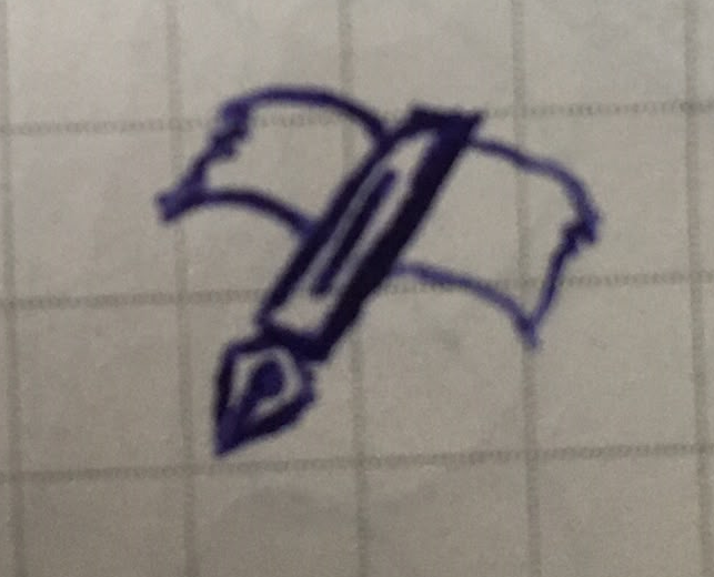
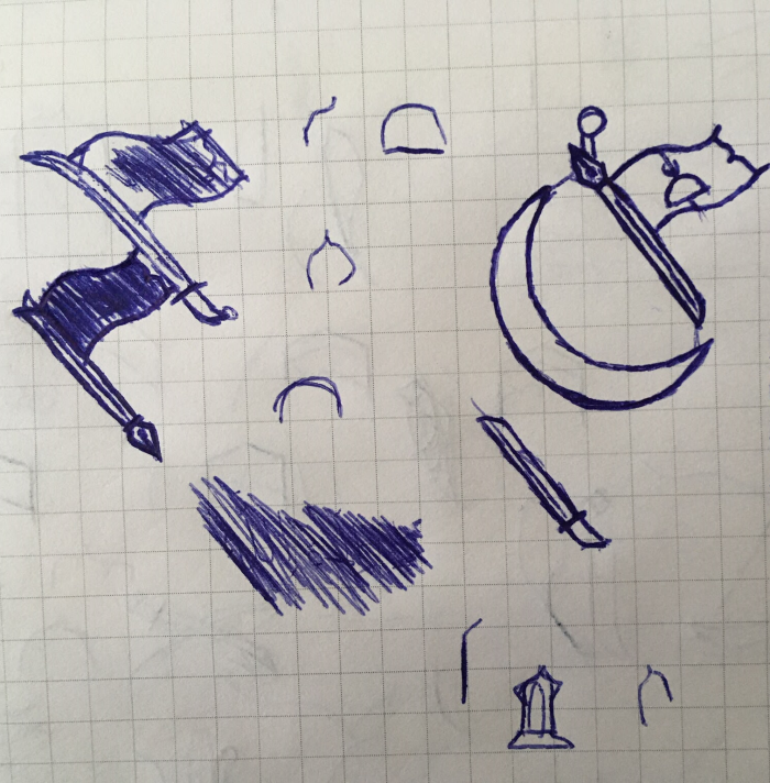
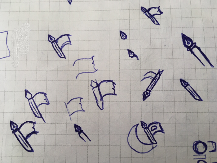
Later, we continued to develop these designs on paper. Then we transferred a few designs we chose to the computer environment and redrew them in the computer environment. Then we made small corrections on them, and finally two logo designs remained. One was a Kaaba design, but there was not much we could personalize, and moreover, we could not make it represent all the meanings we wanted. So we eliminated that one. What remained was our current design, which had existed from the beginning and had been constantly evolving.

Islamic Source Logo
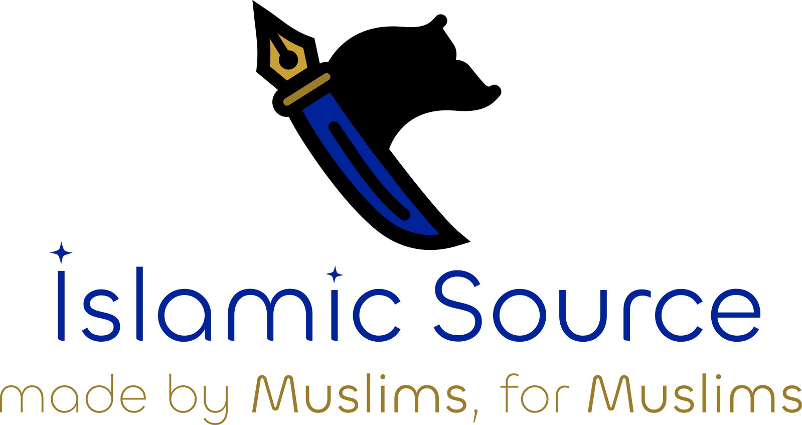
You can see the final result of our logo above. A simple and unique logo, a carefully chosen color palette, a clean font, and a full composition of our logo together with our brand name and slogan. However, despite the simplicity at first glance, our logo might contain much deeper meanings than you think. Let's examine the elements of our logo together.
1- The Pen
 One of the first elements that can be understood at first glance in the logo is the pen. The reason we chose the pen is to represent our respect and love for knowledge and the people of knowledge, to prepare and share scholarly materials, to write beneficial writings for the Ummah, and to represent the intellectual struggle. The reason for choosing a fountain pen was to give a more prestigious appearance. With the pen raised upwards, we emphasize that the pen, when necessary, can be as much a part of the struggle as the sword. Additionally, this form, as we will also point out later, adds a banner feel to the logo.
2- The Sword
 The sword has always been the symbol of struggle. The curved sword is often associated with the Ottoman and, consequently, the Islamic Armies. The reason we use a powerful and controversial image like a sword in our logo stems from emphasizing that what we do is not just passive invitation, but active struggle, and from our love for the act of Jihad that saved Muslims from humiliation, served the spread of Islam, stopped the oppressor, and rescued the oppressed. The sword pointing downwards represents that we are not aggressive, but we will not shy away from any struggle when necessary.
3- The Banner
 The banner is the flag that represents the army, serves as the rallying point for soldiers, provides command and orientation, boosts morale and motivation, and represents authority. In Islamic history, various banners have been used since Prophet Muhammad (peace be upon him). It is narrated that Prophet Muhammad (peace be upon him) also used black and white banners. With the banner, we represent our aims to be a rallying point for Muslims, a common point, a resource for those who want to start the struggle, a companion for those already struggling, and our goal to struggle in the same rank for all Muslims. Additionally, the spear-like form created by making the sword the handle and the pen the tip also represents the moment of a banner fluttering in the wind being planted on top.
4- The Curly Brace
 The curly brace is a character used in almost all coding languages and is generally associated with coding today. Since we also work in the coding and software field, we struggle in the digital realm, and the way we do our work resembles an open-source project, we added this small detail to our logo, also making a reference to our era. This detail also gave an embroidered look to the end of our flag.
5- Color Choice
 I can say that we were also very meticulous when choosing the colors of our logo. We wanted our logo to look both friendly and prestigious at the same time. In this way, both people can adopt it more quickly and see us as one of them, and we wanted to represent how special and prestigious Islam and Muslims, who are tried to be belittled by existing orders, actually are. For this reason, we made the pen in gold color, and the sword in dark royal blue. While the gold color represents prestige, success, value, and knowledge, dark royal blue represents prestige, authority, trust, nobility, peace, relief, loyalty, and professionalism. The black flag is a reference to the banners used by Prophet Muhammad (peace be upon him).
6- Typography
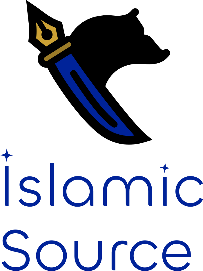 We endeavored to continue the same meticulousness in the typography area. We chose the "Chillax" font family as the font family. With its generally thin, elegant, simple, and rounded structure, we think it is a font that is both noble and adoptable at the same time. We made small changes in the typography in the logo; such as turning the dots into a shining star shape and giving slight curves to the ground connections of the characters. Thus, even our typography became more active and sparkling. The star forms here also carry a small message about the light (nur) of Islam.
7- Full Logo
The full version of our logo achieves a beautiful harmony together. The blue "Islamic Source" writing and our gold-colored slogan convey the message completely. The fact that the "Muslims" expressions in the slogan are made bold also draws attention exactly to the point we want. The black and white versions of our logo are designed to have the same principles. In fact, the black version of our logo was designed first. There are different compositions of the logo, such as the logo alone, with writing next to or below it, or as you can see, with writing below it and the slogan beneath that.
Yes, as you can see, although 15 days is a bit long for a logo, I think we have achieved a result worth all this effort, by the permission of Allah. As we come to the end of our article, we have examined in detail how to choose a good brand name, how to determine a slogan, and how to design a logo, and analyzed it through a real case. May it be a means for good, inshaAllah. While finishing the article, it would be beneficial to mention one or two small points about logo design that we couldn't touch upon in the article:
- Definitely draw your logo first in vector (.svg) format. This way, you can scale your logo to any size you need without losing resolution. Then you can export your logo as bitmap (.png, .jpg, ...) at the scales you want. At this point, you can use the completely free and open-source application "Inkscape" to draw vector logos.
- Before starting the logo design process, preparing a list of questions like the one below, answering them, and then drawing a logo that fits these answers can make it easier for you to achieve the desired goal:
- What is the name of your business?
- How would you define your business/service in one sentence?
- If you are not a new venture, why do you need a new logo?
- What are the short, medium, and long-term goals of your business?
- What do you want your new logo to achieve?
- Who are your main competitors and in which aspects do you differentiate from them?
- What do you like or dislike about your competitors' brand identities/logos?
- Who are your potential customers / target audience?
- Where will your business/service be promoted or published?
- Do you have a specific idea or symbol in mind for your logo?
- Do you want to use your existing brand colors, or are there specific colors you prefer?
- Are there any colors you definitely do not want to use?
- Is there a typeface/font you prefer or absolutely do not want to be used in the logo?
- Which words would you use to describe your logo?
- What message or emotion do you want your logo to reflect?
- Do you have a slogan?
- Should your slogan always be used with your logo?
- Where will your logo be used?
- Are there any logo examples you like? If so, which logos do you like and why?
If we have been correct, it is only from Allah. If we have made a mistake, it is only from us. InshaAllah, it has been beneficial.
May it be a means for good. We await your beneficial prayers.
Assalamu alaikum.
: Logo, Tasarım, Design, İsim, Name, Slogan, Motto
26 .